Thursday, 10 May 2012

Evaluation

Inside of digipak analysis


These are the five different pictures that are included in the digipak, the pictures will be folded inside the album and the last two pictures will look like Jayme-Lee is kissing herself. We decided to include this so the audience could put it on their wall or just keep it if they are a fan of the artist. All five of the pictures are taken at scenes of her music video this is to emphasise the importance of her debut music video! Moreover the shots are very plain but effective at it shows that Jayme-Lee is just like every other girl with the clothing she is wearing.


This form is also incliuded in the digipak it is a chance to win free tickets to see Jayme-Lee live in concert, the colour scheme is repeated throughout the whole of the digipak this is so it shows a theme that runs throughout. This is another reason why the audience would want to buy her album as it shows there are better outcomes if you buy the album rather then downloading it.


This is a free gesture from the artist whereby the audience doesn't have to pay for postage to send off for the free concert tickets, this again may be a selling point of the album as the audience may feel that the artist is trying her best to help them and offer them free tickets!

One Minute Extract!

Tuesday, 8 May 2012

Website Analysis


The website I have chosen to analyse is Mariah Carey’s as I believe she represents all the conventions of a pop ‘diva’. The first thing that stood out when analysing was the colour scheme, Mariah has chosen a gold colour scheme with her name boldly across the top of the screen this is so that the audience is clear of who’s website they are on, to complement the bold banner is a  seductive picture of Mariah which again takes the whole length of the page and represents the conventions of women in the pop industry . This bold image stands out straight away and is one of the first things your eye catches when you are on the page!

Another thing that stood out was that you could watch Mariah’s music video directly on the page, this worked well as it promoted the music video as its one of the first things you see!
Everything on the page is gold apart from the products that Mariah is promoting, this shows that her perfumes and clothes are separate to her music however they are equally as important! Moreover the webiste is very easy to naviagte around therefore this may also be while it appeals to her audience.


The next website I chose to analyse was Rita Ora’s, I chose her as she is a new and upcoming artist and we could get ideas on ways of how to promote!
Just as a coincidence the colour scheme was the same as ours, black white and red! We found again that there was a large image of the artist; this is the first thing your eyes go to and also in bold writing the artist’s name which is really easy to read. The picture is also very seductive, as the artist is pouting her lips, this is where we got ideas for some of the images for our digipak.


Jayme-Lee Website Analysis

This is our final design of our artists website, we looked at various other webistes to see what conventions followed through and with different design ideas this is our final product!

Home page

The home page has a header at the top of it is of our artist's album, we thought that this was the main reason of the webiste, to promote the album. We also have an advertisement accross the whole page advertising the store page and where to get the albums from. We also included a news feed lower down on the page and links to our artists official Youtube account where you can also watch the music video and other relevent videos of our artist, we thought this would be a good idea for fan interaction where they can openly comment on the video, and make comments. We also stuck to a colour scheme of red, white and black for this website. We choose a black background as we thought that the pictures would stand out and the red writing would be bold and clear, moreover we chose a plain simple font so the text would stand out!


Tour dates page


The tour dates page is advertising our artists "addictive" tour, we can also see there is an offcial tour banner accross the page for this tour, we can also see the sponser of the tour is "nike", as it is advertised underneath the tour dates banner. We can also see the dates of the tour listed below and what tour company she is with, which is AEG live. We got this idea from Beyonce's official website, we also noticed how everything on her site was Trademarked so we decided to do the same on our site to give it that professional look.


Biography page

We decided to make a biography page because of our research we done, almost all the singers had a biography page, telling the fans about their life and raise to fame as can see we have stuck to the colour scheme again but also you can see sponsors listed across the page. We looked on Pixie Lott's website and saw she had her list of sponsors up on her website, we thought this would be a really good idea to include them as it makes our artist seem a little more interesting and might grab potential fans eyes. We have her partnerships on there such as record labels and music and tour promoters, as well as her actual sponsors such as Nike Loreal and McDonald's. We also noticed in our research most celebrities have charities that they sponsor so our artist is sponsoring war child and KONY2012. We also have pictures at the bottom on the biography to draw the attention of our audience to the bottom of the page.


Store page


We decided to add a store page titled "Addictive" named after the album, on this page you can find digipak artwork of the album cover, you can also find out where to buy the album from, what official retailers will sell the album and the option to buy the single (which is our music video) separately from the album. We also made the album be sponsored by ITunes, so fans can get discounts from the ITunes store rather than paying the full price for it. We saw this on Rihanna's official website as she is sponsored by a music outlet and thought it would be a good idea. You can also find quotes we made for our artist on the bottom of our page and a reason she made the album, we included this to make the users check out the whole page.


We made the website using Macromedia Dreamweaver where we was able to design the website and insert content and the edit the layout so everything fitted together and looked good. We used Photoshop and Macromedia fireworks to edit the pictures on the website and Fireworks to make the website banner and the tour banner as well. I also edited the scripting and coding to make everything go together when we edited the layout of the website, which was a lengthy process but worth it in the end.


Thursday, 3 May 2012

Jayme-lee biography for website


Jayme-Lee Early Life and Musical Experience:
Jayme-Lee Short was born January 12, 1993 in England. The daughter of a stockbroker and housewife, Jayme-Lee began taking dance lessons at the age of five. At the age of 11 Jayme-Lee received a scholarship to attend London's renowned Italia Conti Academy of Theatre Arts. There she appeared in a wide range of stage productions including Chitty Chitty Bang Bang. At 13 she recorded vocals for Pink Floyd's Roger Waters' opera Ca Ira.
Major Label Signing:

When she was 15 Jayme-Lee answered an ad that simply stated, "Looking for next hot diva." Although the ad asked for someone between the ages of 16 and 25, Lott lied about her age and auditioned anyway. Martin Duke, who placed the ad, became Jayme-Lee’s manager and put her in touch with songwriters in both the US and the UK.
Eventually, American label executive L.A. Reid heard a demo of Jayme-Lee. He flew to England and heard her sing live for him at his hotel. As a result, Reid took her under his wing. Finally, a bidding war resulted in Jayme-Lee’s signing by Mercury Records in the UK and Interscope in the US.
The Style of Jayme-Lee:
Jayme-Lee lists Mariah Carey and Whitney Houston as major influences on her style of singing. However, it is impossible to hear some of her soulful tracks and not think also of Amy Winehouse and Duffy. There is also a refreshing teen energy and freshness to Jayme-lee's recordings.
Jayme-Lee's debut single is 'Addictive', released in April 2012. The single went straight to number one on the UK singles chart as well as the iTunes chart, selling over 50,000 copies and being certified platinum in June 2012.

That same month, Jayme-Lee had performed at the MTV World Stage Live in Malaysia, along with
Kasabian and Dizzee Rascal.

The next single due to be released from Addictive is 'Cruel love’. The video for this single is currently being directed by Jake Nava, who has made a name for himself directing videos for BeyoncĂ©,
Leona Lewis and Shakira.

Jayme-Lee has written tracks for other artists, including Lisa Hordijk (the winner of the Dutch X Factor) and Alexandra Burke. 

 Jayme-Leehas also made a number of TV appearances, in productions such as
Alan Carr: Chatty Man, Loose Women and Friday Night with Jonathan Ross.


Tuesday, 1 May 2012

Front cover ideas!


This was an idea for the front cover but we decided that the other design fitted our artists characteristics more and should be the first image the audience see when buying the album.

Back and front of digipak! ...... Ancilliary Digipak Analysis back Cover

Front and Back cover!


Inside Insert

The main colour theme we decided to use was black red and white, this is because each colour has a symbolic meaning for the artists message, red to show pain and love, black to show a dark side and finally white to represent purity. Colour adds a subliminal message; we took numerous photos however the best photo that fitted the criteria for the back of the digipak was the image of our artist leant against the wall smoking this was because half of the image was the wall so this space was perfect for the song titles. The font we wanted our artists name to be was a ‘signature’ like style of writing this was to add a personal element to the album cover as if it was a present from the artist to her audience the album name was in capitals and a solid bold style of writing this was to symbolise that the entire album is solid and ready!

How does this product create the desired image of your artist?
The picture of the artist shows rebellion and doesn’t show an average 19 year old, this straight away suggests to the audience that the album is something unique and different, moreover the bold red writing stands out which is what we are hoping the music is going to do too. Most of the colours on the back of the album cover are very dark this suggests that the album is going to hold dark hidden messages.

How does this product appeal to the target audience?
The target audience ranges from ages 15 up to about 25 year olds, males and females. We thought about the male gaze and believe that males would be attracted to ours artist as the pictures taken are provocative especially the back cover as our artist is only wearing small shorts. Our target audience may like the images and therefore want to listen to her music and watch her videos. It would appeal to girls as they may see her as a role model and want to be like her as our artist produces a fresh and cool image. Pop music is very popular with girls/young women and therefore, the artist would have many young men and women looking up to her. Moreover, the colour scheme is very eye-catching as the red is a bright colour which stands out. Boys may see it as a seductive colour and it could also be represented as danger, fiery or love and by using their imagination.

How does this product meet or subvert the conventions of digipak design you identified in your analysis of existing products? I researched Rihanna’s current digipak and decided base some ideas around hers. I found that the images on the front cover, tended to be close up shots of the artist themselves with usually a seductive look wearing minimal fashionable clothes. The images was the main aspect of digipak’s I researched this is because it is the first thing the eye goes to when looking at the album covers. Our digipak is very similar to these ideas as we used a side shot image of our artist smoking and wearing minimal clothing the rest of the picture has very dark colours in (which is overpowering) we needed the song names to stand out so on a black back ground and red writing the text was very effective. I added a parental advisory badge to add more of a symbolic message that this is a dark album. I also added the artist’s website as the audience can keep track of any other major events, and as it was a common thing on most digipak’s.

How does this tie in with your music promo?
This helps music promotion as the photos produced show a stylish modern side to our artist and make the audience want to see what she is also capable off.

How does the digipak represent the artist?
The black and white colours symbolise the darkness of the album however the bright red shows that the album isn’t boring and there is pain and love present throughout the whole album! The pictures show a seductive look to our artist this is to fit the male gaze and to show that the artist is attractive, as you may be able to see on the back cover our artist is wearing different colour socks, its small things like this that represent originality and a fresh style!

How does this appeal to the audience?
Our digipak will appeal to both males and females; it will appeal to males because our artist is both attractive and the unique style makes people want to know and hear more! Moreover it will appeal to females because they may see our artist as retro and her unique style will stand out! They may see her as a role model.

Back of digipak!


This is my final design of the back of the digipak, i tried to keep the colours to white and red as this is our main theme colour.

Monday, 23 April 2012

Our Music video!

Audience Feedback

On the 19th of April we had a showcase to show our work, overall the feedback we recieved was really positive.
The first question that was asked was if the audience felt that the choice of setting in the video was appropriate alot of people said yes and that the conventions of the pop genre were all present, we then asked how successful was the video in satisfying the conventions of the genre alot of people said yes there were successful moments but the lip syncing was abit off.
We recieved very good comments for the editing, 'very clean cuts'and alot of people said that the shots flowed, we then asked about the cinematography how successful were the choice of camera angles and movement most people said good and that the fast cuts and flashing went well with the genre and the shadowing was effective.
We asked if the narrative of the music video suited the theme of the song overall everyone said yes, moreover we asked if the narrative was easy to follow the response we got was ' reasonably easy to follow'. We asked if the audience was entertained throughout the video and some people said 'at times' but most said they were!
A question that is key for our evaluation is which bit of the video was most sucessful most people agreed on the strobe light scene but others said the arguing scene.
The last question we asked was what could we do to improve our music video most people said the lip syncing and we are going to edit the video more effectively.

The average score we got for our music video was 8.4!

Sunday, 15 April 2012

Digipak!


This is the picture that we are going to use for the back of the digipak, we are going to try to edit it so its black and white and only the red lipstick is in colour and the smoke is more whiter.

Testing Shots

One scene in our music video is of drugs falling this is to represent the 'lows' of the video. We couldnt use real drugs to we used tic tacs and had to film them falling numerous times to get the best shot. We threw them from different angles so it would look like they were coming from different directions, then when we found the best shot we used imovie to slow the shot down so that it would look more convincing.

Final Draft of Text


This is the first draft of the front cover of our digipak. We decided to use a red title and album name with a black and white image. This is so that it stands out and grabs the attention of the audience. Red symbolises pain and love which is what our artists album is all about therefore that is why the text is red! The picture behind the text is going to be black and white however the artists lips are going to be red this is so that it fits in with the theme and also to give the artist a sense of belonging, showing she is the centre of attention and that the digipak is all about her.

Wednesday, 28 March 2012

Font ideas

We tested out fonts that we thought would be ideal for our digipak. 'Jayme-lee' is our artist's name and we chose fonts like this to symbolise a signature, so that it would look like a personal feature on the album cover.

Friday, 17 February 2012

Pre production: Script and STORYBOARD!!

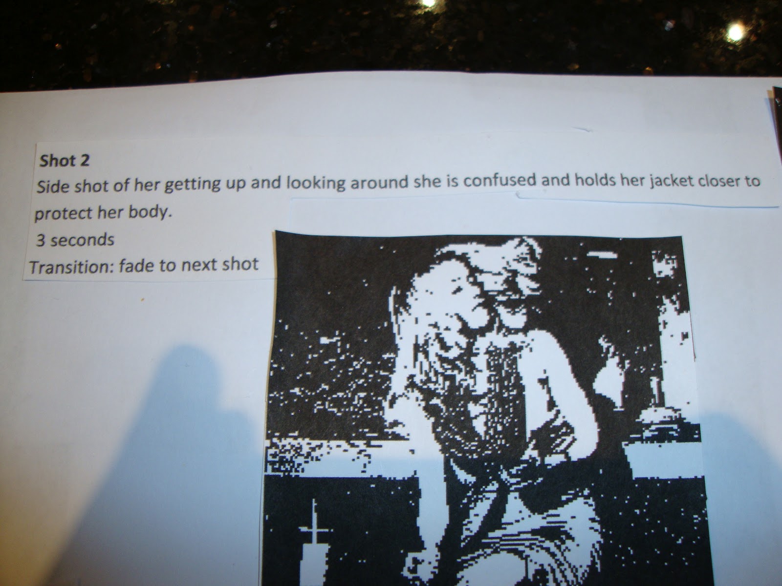
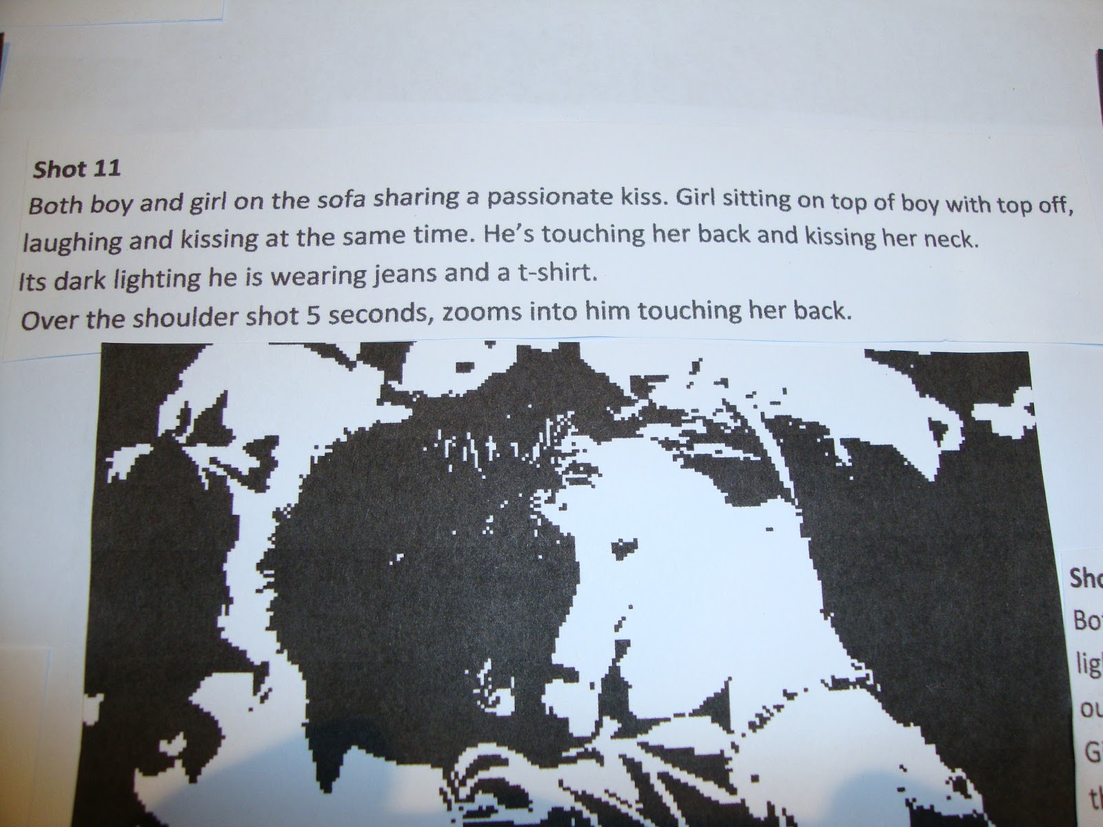
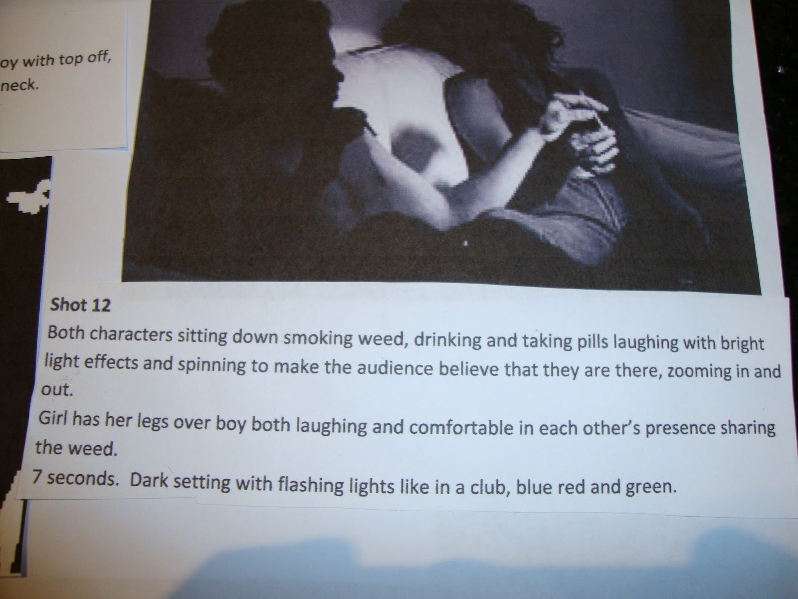
 I made a detailed storyboard of shot by shot in the music video, now we have this we can start shooting, as this is the key guide we need to follow so that our music video is what we want it to be .


However an ideas board was created first so that all my ideas could be put together and the shots would be what i wanted!


Then i roughly scetched the shots that i wanted before finding appropriate images on the internet to match my ideas

Monday, 5 December 2011

Pre Production

Shooting Schedule
Times
Mon
Tues
Wed
Thurs
Fri
Period 1+2
Media lesson
 -
 -
 -
Filming media video
Period 3+4
 -
 -
Media lesson
Filming media video
 -
Period 5+6
Filming media video
 -
 -
 -
 -

These were the hours that our group had free lessons and so we decided that these were the hours that we would shoot our music video. We will also need some extra hours for editing once our video is completed and therefore we may need to do this independently to be able to reach our full potential in our media coursework.

The roles and responsibilities of each member of the group:
Charlotte: Editing, actor, takes care of and prepares props.
Luke: Director, camera assistant, editing.
Marianna: Editing, actor, sound recordist.
Molly: Actor, editing, costume designer.

Shooting Questions


a) What is the videos theme?
As a group we have decided that we want to represent today’s youth society in our video; the song states a ‘messed up generation ‘therefore we want to show a realistic insight into today’s youths.We want the video to be fun an exciting and be something that youths can relate to, exploring different dimensions such as different perspectives from different types of people. We don’t want the video to be a clichĂ©; we want to bring something unexpected and unique.We want the video to be fast moving, suggesting that young people’s lives are fast tempo and independent however we want our viewers to get a gritty insight into the lives of some that they would rather not see.

b) What are its mood progressions?
One of the aims of our video is to show the fast moving mood changes in the characters.We want the video in theory to be ‘messed up’ therefore there needs to be many highs and lows and changes of happy moods to depressing moods, one of the ways we are going to show this is by the use of colours and lighting, deep blues red and black obviously represent dark down times however bright natural greens and pastel colours can show a fresh organic attitude.

c) What kind of location should each sequence have?
Each location should be suited to the scene; one of our group’s aims is to incorporate as many different scenes into our video as this will show the fast moving tempo and the different stories we are trying to represent this will also portray the different cultures and unique styles that youths society has.

d) What statement should each location make towards the videos premise?
Our theme is to make the video as vibrant and loud as possible and each location should match the theme for example if we are trying to show fresh or new attitudes we may plan to film outside as this can be symbolic to the point we are trying to make.Our idea is to show different reflective moods therefore we may need to film in a number of different places, for example we want to show real aspects of youths lives; not everyone enjoys the same social things therefore we may need to film in schools, pubs clubs or even in a home location.

e) How should each set be lit?
Each set should be lit according to the mood we are trying to portray, for example if we want to show love then the colour reds may show this or if we want to show a ‘dark side’ to someone then black would show danger and being lost.

f) What kind of props goes with the set?
We will need to make a full schedule plan of what needs to be in every set, props play a major part in showing a scene and making it believable, therefore we need to think about what is being included. We are also working on a very tight budget therefore we may need to think about what is necessary to make our final piece to the standard it should be.

g) What kind of belongings do the characters need to keep around them?
We want to show diversity in our characters therefore each character will represent a different sort of person for example the ‘bad child’ may be carrying alcohol, cigarettes and maybe even drugs. We want to show the path that a child may be lead into. However some of the other characters may represent the good in today’s youth as in the media today’s youth are always seen as being bad rather than doing anything positive towards society.


h) What kind of clothes does each character wear and what do the clothes tell us?
Clothes play a major part in our video as it will be one of the things our audience will be looking at first, as our theme is pop we want to show popular clothes that people wear as these people will be our main target audience and want to relate to our video. High street brands will be included as we want our video to represent today’s youth society and show a normal society.


I) What colour palette and progression would promote the videos thematic development?
We want the whole of our video to be fast moving as the song itself is very fast tempo with scenes constantly changing, the theme is gritty British society therefore moods need to be up and down to show reality, colours need to be vibrant and loud.

Shooting Script Questions
What do you need to show to establish 
environment?
During our video we will need to establish the environment, not just the physical environment but also emotionally. The words ‘we found love’ shows that there is also an emotional environment that will need to be portrayed to the audience. In order to do this we will need certain props that symbolize love or affection. These may include, lockets, rings etc. The external environment will need to be quite dark and gloomy to represent the message of the song. The song lyrics say ‘We found love in a hopeless place’ so as a group we will need to establish our environment using scenery and scenarios that symbolize failure and gloom. Options that we thought of were
• Dark windy night
• Rain
• Girl walking home after a night out alone
• Alcohol
• Partying (to symbolize the waste of life)
When do you show establishing information?
As a group we believe that the establishing information should not be shown throughout because from the point of view of the audience it is a good method to leave the audience wondering. It is important to show the information enough so that the audience can establish a story line however too much could make the video tedious.
When do characters move and how to show movement?
When characters move we can use a wide range of camera angles, some of these are;
• Wide camera shots, wide shots give an outside POV, from somebody watching at a distance, if the camera angles then zoom in this can show somebody on the frontline of the shot but still from an outside perspective.
• Panning shots to get an outside perspective of the characters movements, this can follow the character to give an insight of the footsteps, it is as if the outsider is watching the character, so this enables the audience to really
• Over the shoulder shot, this gives the audience the perspective from the characters viewpoint; it allows the audience to be interactive with not only the music video but also the star.
• Let the character leave the frame, this shows that the character is moving as the camera is not following her, this movement is subtle and only really gives the POV to the audience that they are behind the camera filming the character, and that their movement was a quick glance.
• Let the camera move around, shows a substantial amount of movement as it gives a varied POV that show different shots.
• Fast shots show movement, as the different shots show that it is fast paced which often can represent movement but show the POV from behind the camera

What are significant eye lines and when do they change?
• Looking directly into the camera shows a connection between the viewer and the video itself, this form is often used during emotional scenes an typically your ‘love song’
• Looking up at a camera is often symbolizing a message
• Looking back at the camera can represent a goodbye
• No eye line at all, no eye contact can give an outside perspective

When and why does the camera move?
The camera can move for a number of different reasons, for example during a panning shot the camera would be following the character and would therefore need to move, by the camera moving –this shows movement through the camera use rather than editing. Camera movement can seem messy however often it is used during party scenes, to make it seem as if it is an amateur camera man.

G) Focals and composition can affect the narrative of the story, if a certain image is focused and another is not focused, this makes the audience look at the focused image, contrast can distort the background so really makes the audience view the image/shot up front. The framing of the shot can make the audience target the characters movements, these editing settings help the audience focus on certain images. If a certain character is less focused than another then the audience will focus on the focused character. If a character is in the centre of the frame then this is the character that will be most recognised.

H) If the shot is imperative for the narrative then it is important to not only spend more time on this shot but also include more editing techniques, however in certain situations it may be necessary to keep the shot simple rather than over edit and ruin the shot. Impact shots need to make a statement, and to do this the audience need to remember it, often this is done with memorable situations or something that creates a stir/buzz, this then ensures that the audience remember this particular shot and can then link this to the narrative.
Health + Safety issues 
We have had to take many steps into minimising the health and safety issues whilst planning the shooting our video. First of all, we wanted to shoot scenes of people dancing in a club, as this fitted our brief, but we realised that we may not be able to do so. This could also be a threat to us a group as we would be in an unreliable environment and the camera could become damaged or we could even end up injured. Another health and safety issue could be that if we posted on our blogs where and when we will be filming, we are broadcasting it worldwide and therefore this could become a danger to us. We need to keep the location and times to our group to minimise these issues.  There will be shots in our video where we need to use high angle shots. This would mean that someone will have to climb up on a ladder or chair for example, but these will arise the safety issues. Therefore we decided that we would tape the camera to a wall at the angle that we need to prevent anyone from being in danger. 
The costumes and props in which we intend to use: