
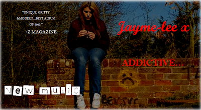
Front and Back cover!
Inside Insert
The main
colour theme we decided to use was black red and white, this is because each
colour has a symbolic meaning for the artists message, red to show pain and
love, black to show a dark side and finally white to represent purity. Colour
adds a subliminal message; we took numerous photos however the best photo that
fitted the criteria for the back of the digipak was the image of our artist
leant against the wall smoking this was because half of the image was the wall
so this space was perfect for the song titles. The font we wanted our artists
name to be was a ‘signature’ like style of writing this was to add a personal
element to the album cover as if it was a present from the artist to her
audience the album name was in capitals and a solid bold style of writing this
was to symbolise that the entire album is solid and ready!
How does this
product create the desired image of your artist?
The picture of the artist shows rebellion and doesn’t show an average 19 year old, this straight away suggests to the audience that the album is something unique and different, moreover the bold red writing stands out which is what we are hoping the music is going to do too. Most of the colours on the back of the album cover are very dark this suggests that the album is going to hold dark hidden messages.
The picture of the artist shows rebellion and doesn’t show an average 19 year old, this straight away suggests to the audience that the album is something unique and different, moreover the bold red writing stands out which is what we are hoping the music is going to do too. Most of the colours on the back of the album cover are very dark this suggests that the album is going to hold dark hidden messages.
How does this product appeal to the target audience?
The target audience ranges from ages 15 up to about 25 year olds, males and females. We thought about the male gaze and believe that males would be attracted to ours artist as the pictures taken are provocative especially the back cover as our artist is only wearing small shorts. Our target audience may like the images and therefore want to listen to her music and watch her videos. It would appeal to girls as they may see her as a role model and want to be like her as our artist produces a fresh and cool image. Pop music is very popular with girls/young women and therefore, the artist would have many young men and women looking up to her. Moreover, the colour scheme is very eye-catching as the red is a bright colour which stands out. Boys may see it as a seductive colour and it could also be represented as danger, fiery or love and by using their imagination.
How does this
product meet or subvert the conventions of digipak design you identified in
your analysis of existing products? I researched Rihanna’s current digipak and decided base some
ideas around hers. I found that the images on the front cover, tended to be
close up shots of the artist themselves with usually a seductive look wearing
minimal fashionable clothes. The images was the main aspect of digipak’s I
researched this is because it is the first thing the eye goes to when looking
at the album covers. Our digipak is very similar to these ideas as we used a
side shot image of our artist smoking and wearing minimal clothing the rest of
the picture has very dark colours in (which is overpowering) we needed the song
names to stand out so on a black back ground and red writing the text was very
effective. I added a parental advisory badge to add more of a symbolic message
that this is a dark album. I also added the artist’s website as the audience can
keep track of any other major events, and as it was a common thing on most
digipak’s.
How does this tie in with your music promo? This helps music promotion as the photos produced show a stylish modern side to our artist and make the audience want to see what she is also capable off.
How does this tie in with your music promo? This helps music promotion as the photos produced show a stylish modern side to our artist and make the audience want to see what she is also capable off.
How does the digipak represent the
artist?
The black and white colours symbolise the darkness of the album however the bright red shows that the album isn’t boring and there is pain and love present throughout the whole album! The pictures show a seductive look to our artist this is to fit the male gaze and to show that the artist is attractive, as you may be able to see on the back cover our artist is wearing different colour socks, its small things like this that represent originality and a fresh style!
How does this appeal to the audience?
Our digipak
will appeal to both males and females; it will appeal to males because our
artist is both attractive and the unique style makes people want to know and
hear more! Moreover it will appeal to females because they may see our artist
as retro and her unique style will stand out! They may see her as a role model.
No comments:
Post a Comment